

Changing Things

At our firm, modernization and change are constant priorities. We actively monitor evolving trends and adapt our practices to align with them, ensuring our brand remains relevant and competitive. By embracing innovation at the right time, we not only meet but exceed consumer expectations. This commitment allows us to deliver products and services that satisfy our customers while maintaining the standards of quality and excellence that define our brand.
Brothers retail
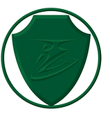
2000
The Brothers Group logo, created under the Chairman’s supervision, symbolizes a shield of protection against retail fraud. The green reflects Saudi Arabia’s national color.
The Trade Marks Act, 1999, INDIA,

2005
The Brothers Group logo, created under the Chairman’s supervision, symbolizes a shield of protection against retail fraud. The red color symbolizes strength against challenges.
The Trade Marks Act, 1999, INDIA,

2025
Our new logo blends elegance and modernity, uniting past colors while forming the letter ‘B’ to represent Brothers and a more advanced shopping experience
The Trade Marks Act, 1999, INDIA,
Trademark Law of the Gulf Cooperation Council (GCC Trademark Law), 2014
HAI International

2014
HAI logo combines warm red and gold, symbolizing good luck embraced worldwide, with a hand motif that greets customers with a welcoming ‘Hai.
The Trade Marks Act, 1999, INDIA,
Trademark Law of the Gulf Cooperation Council (GCC Trademark Law), 2014
Trademark Law of the People’s Republic of China,1982

2025
The new HAI logo in black reflects modern simplicity, blending with all aspects of the brand. The line across it signifies a journey— from the world to HAI, and from HAI to the customer.
The Trade Marks Act, 1999, INDIA,
Trademark Law of the Gulf Cooperation Council (GCC Trademark Law), 2014
Trademark Law of the People’s Republic of China,2019
BMC Hospital

2018
Our hospital logo represents protection and trust, assuring patients of safe, fraud-free treatment. The snake within the emblem reflects the universal symbol of medicine and healing, emphasizing care, integrity, and health.
The Trade Marks Act, 1999, INDIA,

2025
The new blue logo reflects modernity and trust. Its twin arrow motif represents our careful coordination from suppliers to services, ensuring seamless delivery of the best care to our patients.
The Trade Marks Act, 1999, INDIA,
Hospitality

2021
The golden ‘M’ logo symbolizes luxury, warmth, and harmony, reflecting prestige and a welcoming embrace for every hotel guest.
The Trade Marks Act, 1999, INDIA,

2022
Inspired by Indian architecture, the logo reflects tradition and elegance, inviting guests on a journey through cultural heritage while offering a timeless, luxurious hospitality experience.
The Trade Marks Act, 1999, INDIA,
Ruwad

The Ruwad logo, in maroon and gold, signifies tradition and excellence. With ‘Ruwad’ and Arabic ‘رواد’ meaning pioneers, it reflects leadership in delivering premium spices and rice with authenticity and trust.
The Trade Marks Act, 1999, INDIA,
Trademark Law of the Gulf Cooperation Council (GCC Trademark Law), 2014